Rotten in Denmark
Logo / Branding
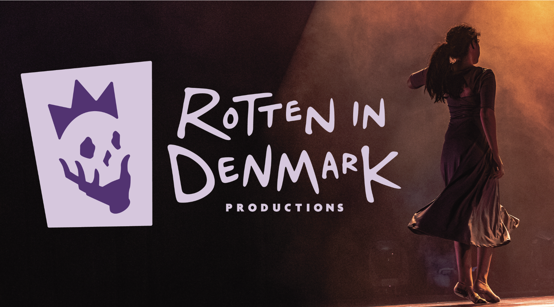
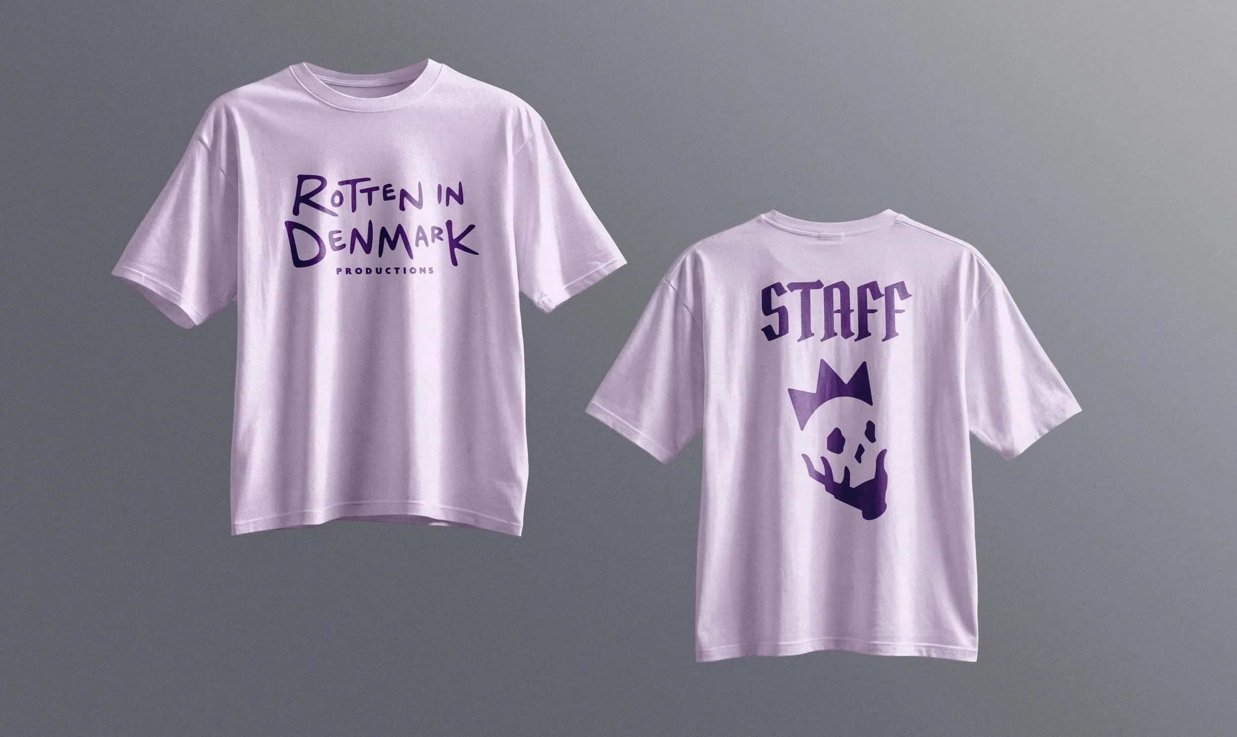
Rotten in Denmark is a growing Portland-based theater company with a focus on Shakespeare productions and an emphasis on community, inclusivity, and diversity.
Brief: Redesign the logo for the company, combining theater/Shakespeare themes with the company’s bold and scrappy personality to create something with a quirky, welcoming feel.
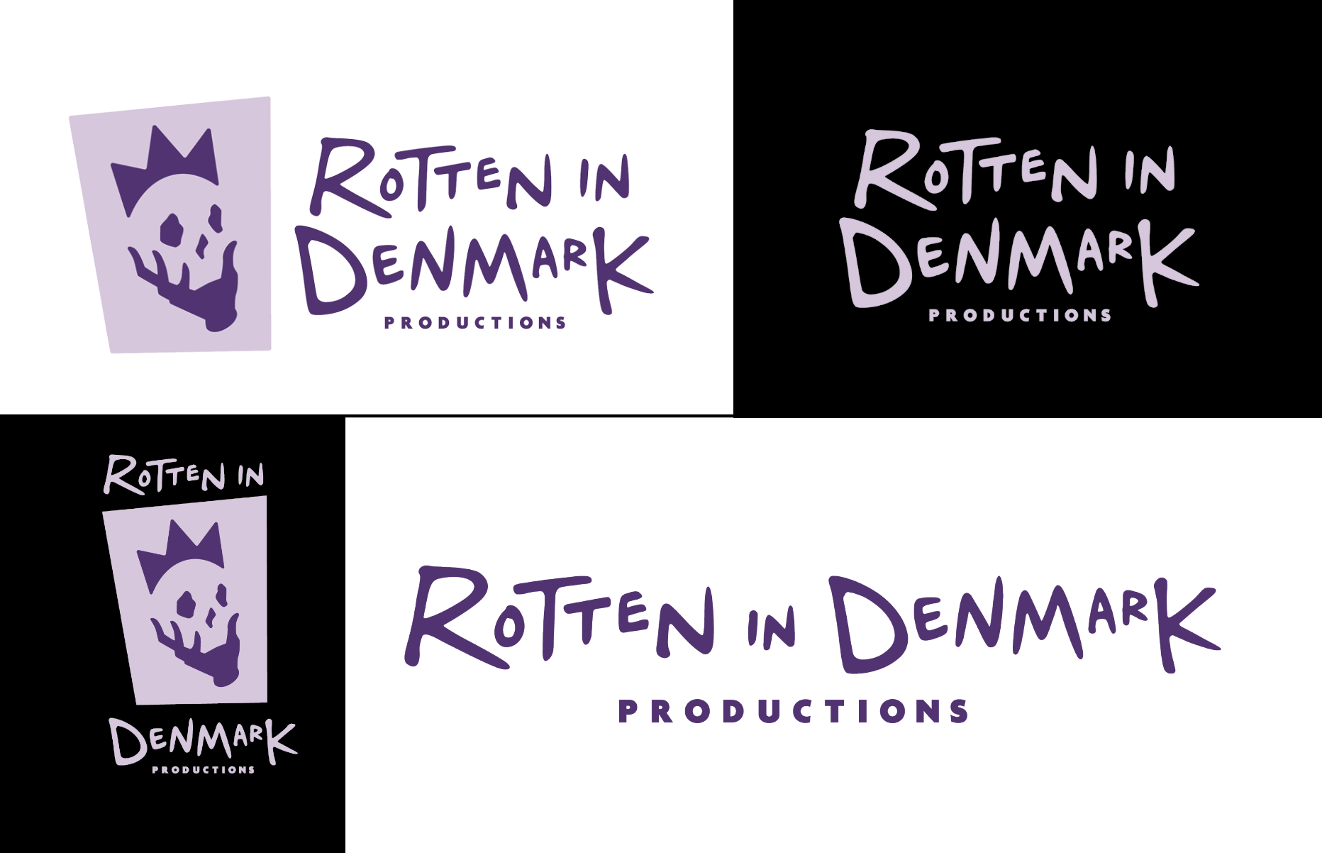
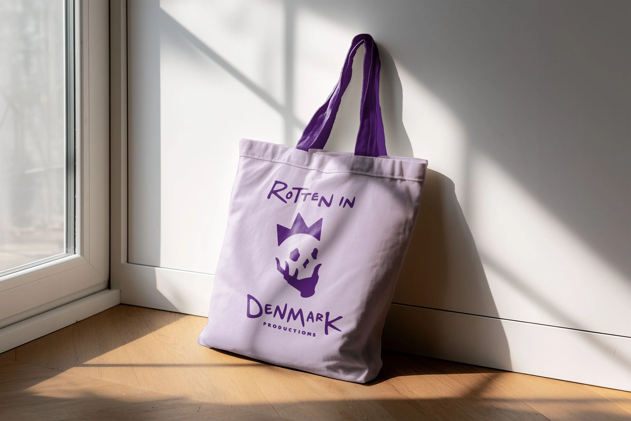
Design: The logomark is an abstraction of the popular “Alas, poor Yorick” pose (a nod to the play from which the company’s name is derived, “Something is rotten in the state of Denmark”). The crown and the hand serve as the outlines for the skull for a clever-looking design. The wordmark is playfully handwritten to reflect the company’s more “scrappy” personality, and the shapes are rounded to both simulate natural ink flow and give a friendly feel.
A Midsummer Night’s Dream
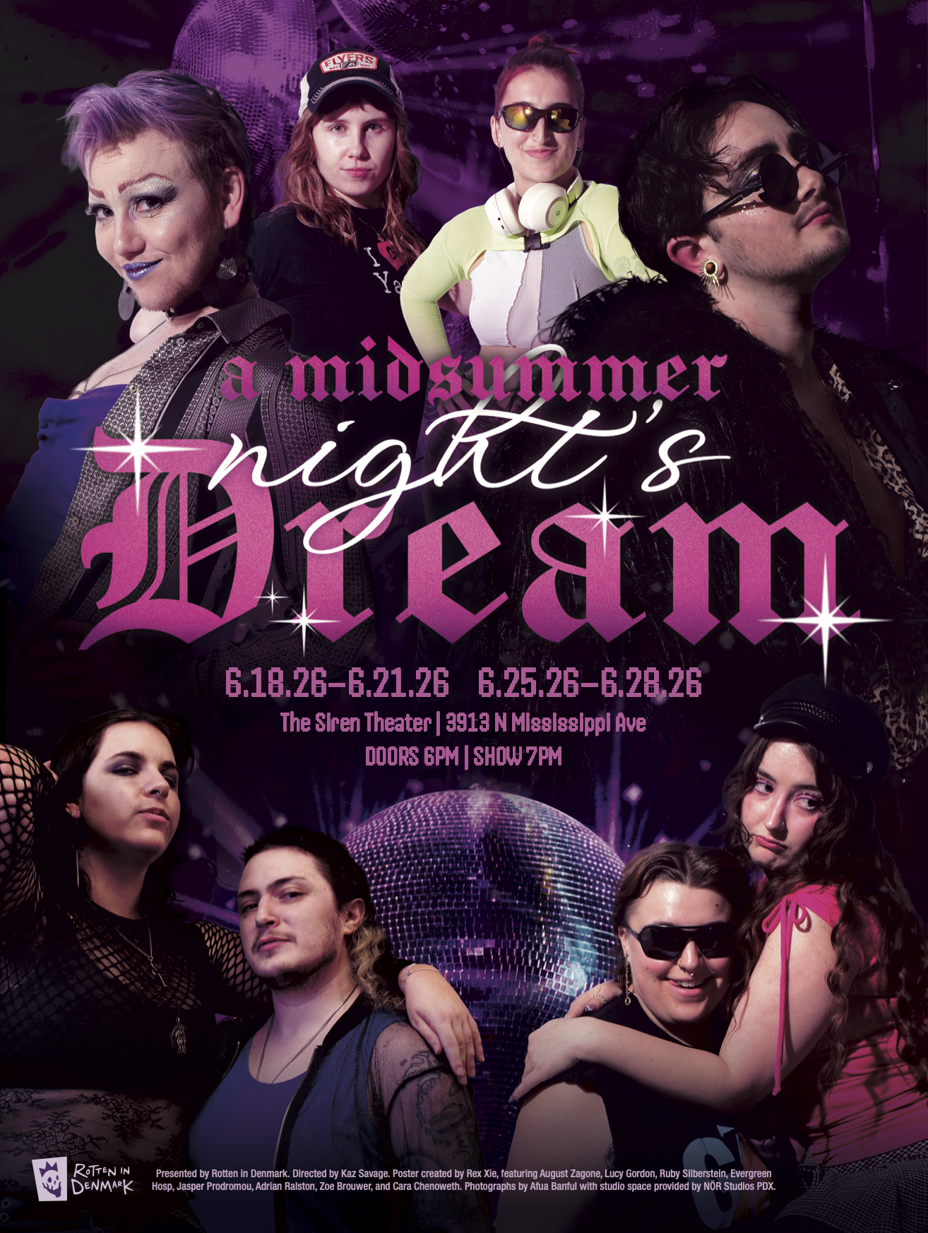
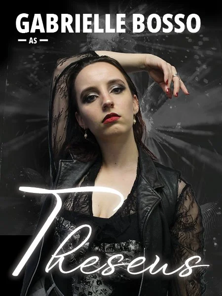
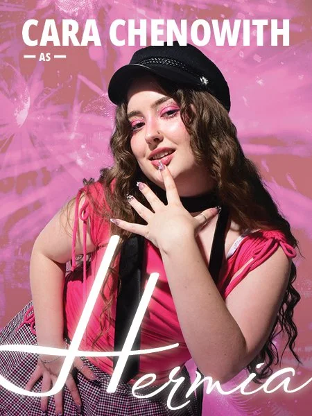
Rotten in Denmark’s summer 2026 production was a queer reimagining of Shakespeare’s A Midsummer Night’s Dream. The show follows the original script, but set in a modern-day gay club. The cast featured local drag kings and queens, and sections of the play were done as drag acts, complete with techno music and ballroom choreography. The production was a resounding success for the emerging company, with all eight shows completely sold out.
Brief: Create a visual brand and design assets that encapsulate the fun, modern energy of the production.
Design: The design is heavily inspired by club event posters and advertisements for reality drag shows such as Ru Paul’s Drag Race. Fun typefaces, sassy poses, and plenty of disco balls are combined to create a bold and alluring visual brand.
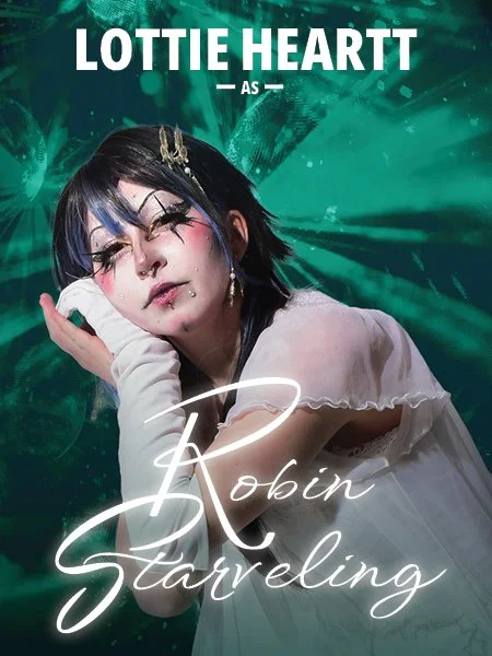
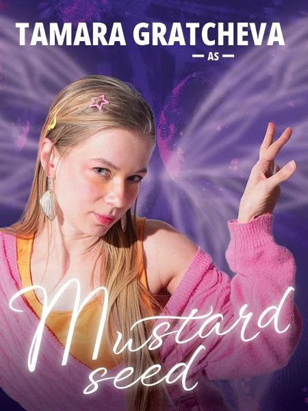
Final deliverables: Full-size poster, letter-size flyers, social media graphics, cast portraits.
In collaboration with production director Kaz Savage and photographer Afua Banful.
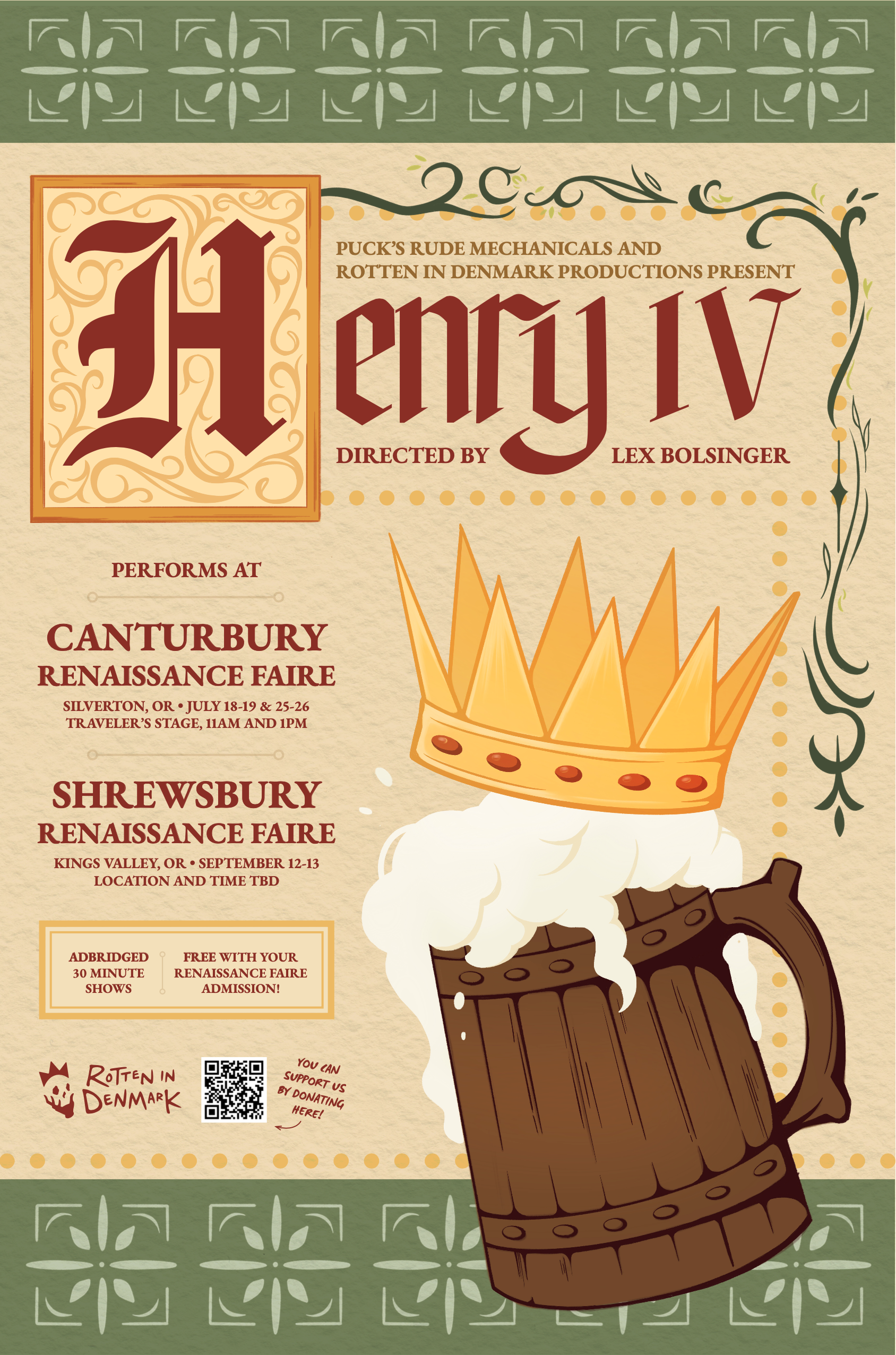
Henry IV
Rotten in Denmark’s Renaissance Faire Troupe, Puck’s Rude Mechanicals, put together a condensed version of Shakespeare’s Henry IV for their 2026 show.
Brief: Illustrate a beer stein wearing a crown for this show, and design deliverables around this illustration.
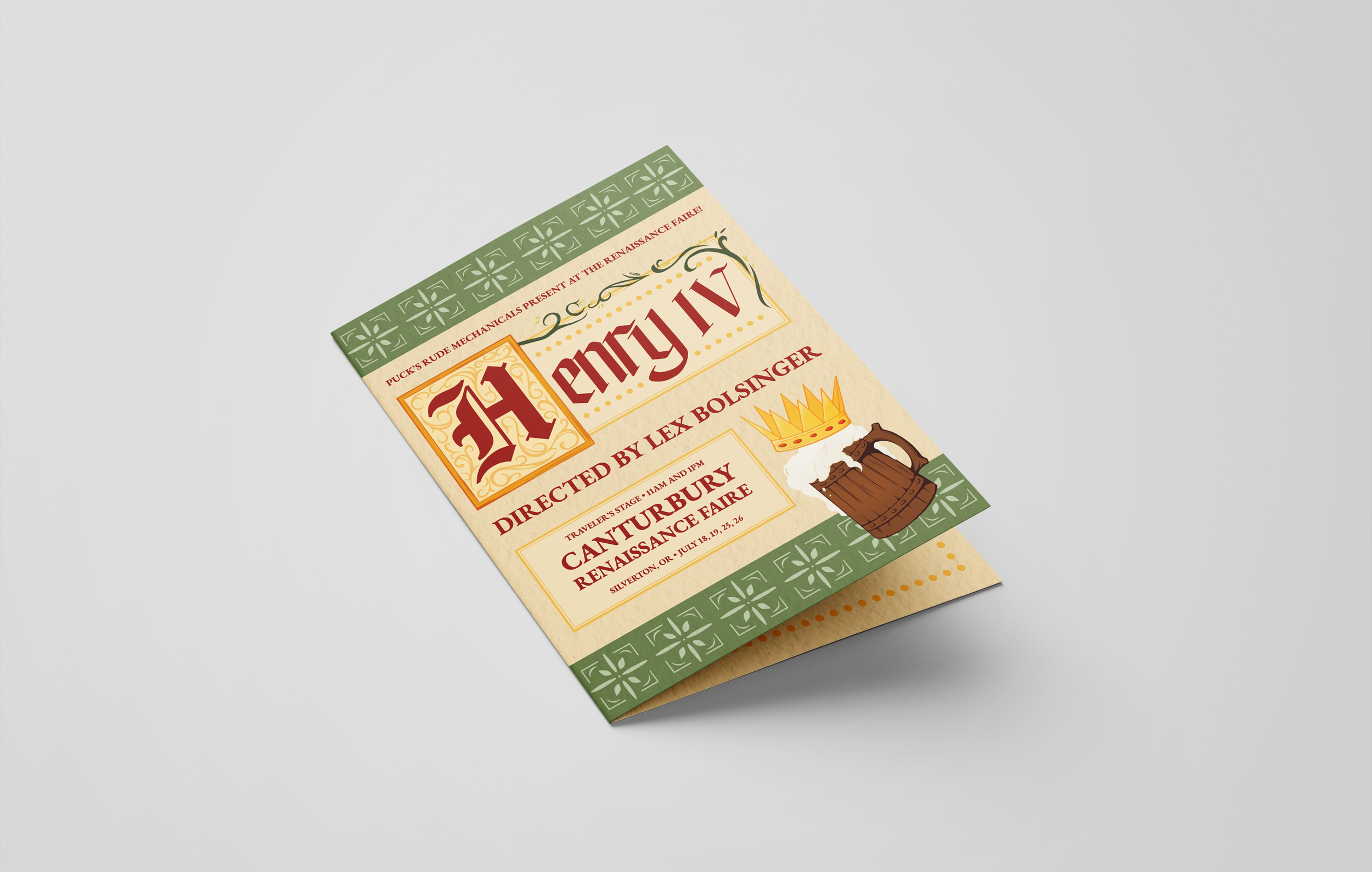
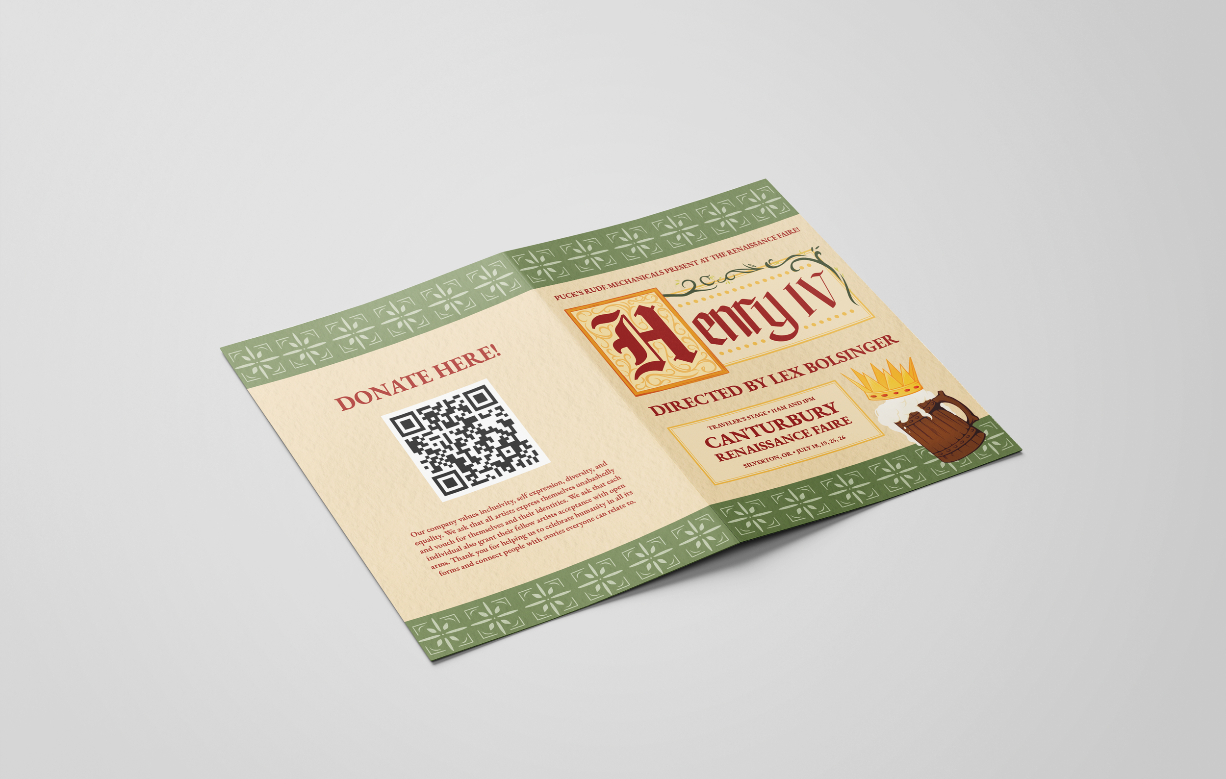
Design: The visual brand for this show is heavily inspired by Renaissance-era illuminated manuscripts to combine the layout seamlessly with the beer stein illustration. The title is custom hand-lettering in a narrow blackletter with non-standard elements to add some modern personality.
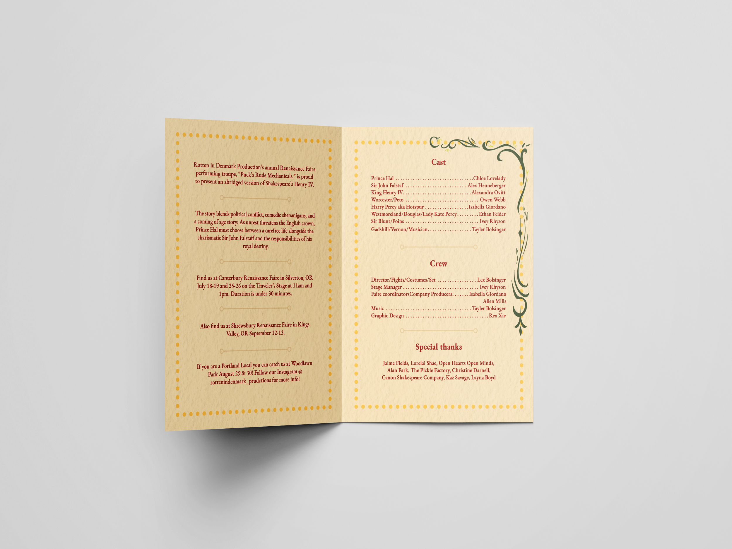
Final deliverables: Full-size poster, half-letter folded flyers, social media graphics.